8. A new way to understand limited overs cricket
OK, this is an advertorial. However, nobody is paying me for this because I’m trying to promote my own (free) product through this edition of the newsletter.
Those of you who follow me on social media may have seen this graphic before. I even alluded to this graphic when I tried to calculate “interestingness” of a cricket match. With the World Cup starting today, and absent of any hitherto hidden bugs, this graphic running “live” through the tournament, it is a good opportunity to try and get you interested in this graphic.
At the heart of it, I calculate the likelihood of each team winning after every ball, and then join the dots to get a line. And this line, I claim, represents the “story of the game”. There is a little rule-based artificial intelligence engine that runs through the game, annotating key periods, innings, overs and partnerships. And by summing up the change in probabilities after every ball, we can compute the overall impact of a batsman or a bowler.
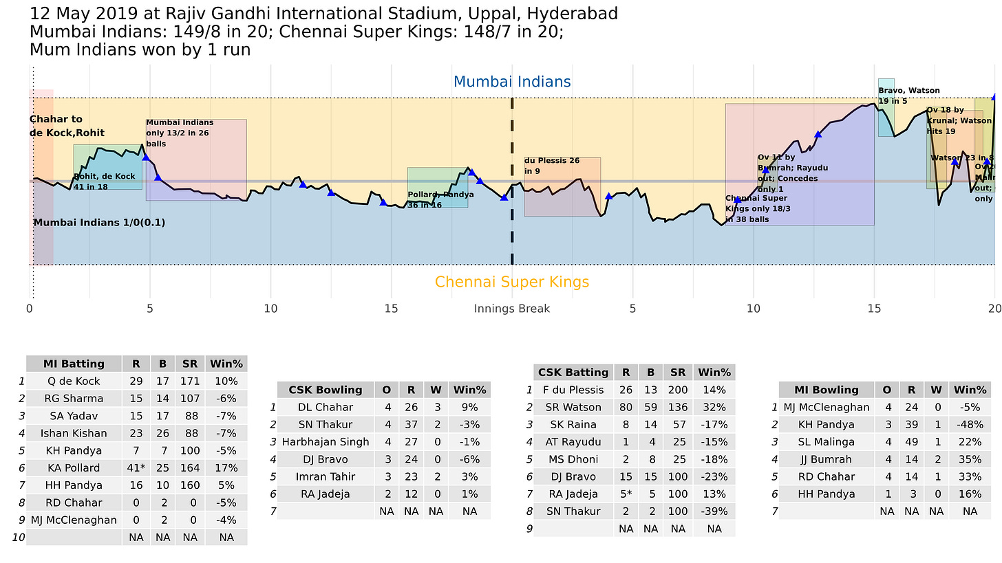
This is what the IPL final looked like after the game was over:

There are a few bugs, but you can see how this tells the story of the game. The higher the line goes, the greater the chances of the team batting first winning. The lower it goes, more probable the chase. The boxes (which still overlap uncomfortably in some places) tell you what the key phases in the game were.
For example, the IPL final was reasonably balanced until the ninth over of CSK’s chase, after which MI pulled ahead by conceding only 18/3 in 38 balls. Watson’s assault on Krunal, which brought CSK back into the game, is indicated. And then there is the back-and-forth towards the finish.
And by looking at the batting and bowling tables below, it is clear that Jasprit Bumrah is the most impactful player for MI, closely followed by Rahul Chahar (unfortunately his dropped catches are not counted).
Now, this graphic assumes that an average eleven plays an average eleven, so nuances such as players who are at the crease are left out. The model is Markovian, and doesn’t care about how long players have been batting. It just uses the current runs, balls and wickets (and target if the second team is batting) to calculate the probabilities of each team winning.
To calculate the probabilities, it is a sort of WASP-like model. There is an overlay (a Bayesian model) where the model tries to learn the nature of the pitch based on the runs and wickets through the game. So depending on how the runs have been scored, a team scoring 300 might have either a 60% or an 80% chance of winning.
You can follow the World Cup through this link. As and when the games progress, the graphics will get updated, along with the key events and periods so far. The interactivity on the left (which I built using an R package called Shiny) allows you to pick the number and kind of events you want to see. Clicking on the Manhattan below tells you what happened in that particular over. Clicking on the graph itself tells you the score at that point in time.
The model will update every three minutes. In case you don’t have patience for the interactive graphic, there is a static version as well. That can be accessed here. This is what the England-South Africa game looks like as of now.

As the tournament goes on, I might come back to this graphic to analyse particular games. There might be some trends in the stories. There might be games that are remarkably similar to other games, in terms of the story. And we can watch this space for the impact as well.
Let me know what you think of this. And don’t forget to subscribe to this newsletter if you’re not already a subscriber - regular service will resume tomorrow and this will go out three times a week. And share this with whoever you think might find it interesting.
Cheers! And enjoy your world cup!

